Basic pie chart example
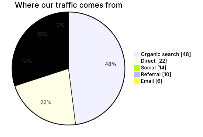
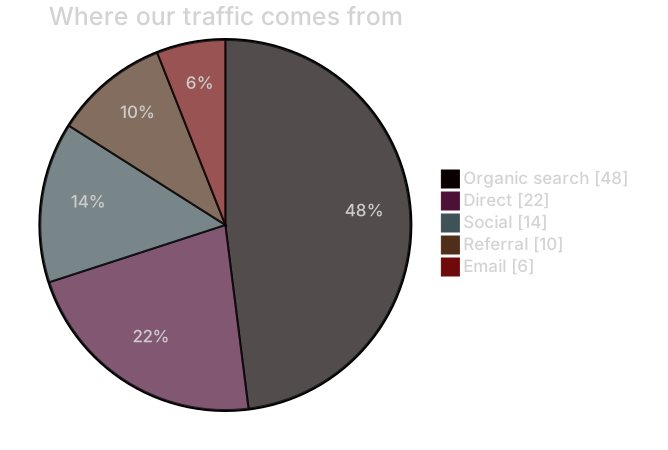
pie showData
    title Where our traffic comes from
    "Organic search" : 48
    "Direct" : 22
    "Social" : 14
    "Referral" : 10
"Email" : 6Mermaid pie charts are the fastest way to show proportions in documentation. You list labels and values, and Mermaid computes the percentages, colors and legend for you.
They're handy for survey results, budget splits, traffic sources and test coverage summaries — anywhere a quick visual beats a table.
When to use a pie chart
- Survey and poll results
- Budget and cost breakdowns
- Traffic or revenue by channel
- Language or test coverage summaries
Pie Chart syntax reference
| Syntax | What it does |
|---|---|
pie | Start a pie chart. |
pie showData | Also print raw values in the legend. |
title Text | Chart title. |
"Label" : 42 | One slice; values must be positive numbers. |
Pie Chart examples
Budget split
Values don't need to add up to 100 — Mermaid calculates percentages.
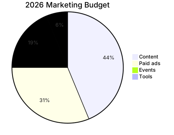
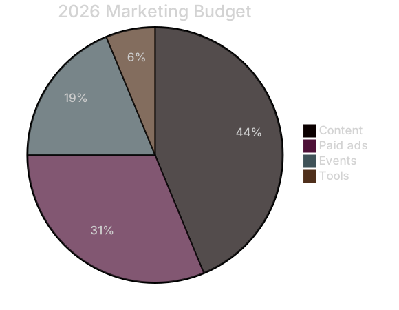
pie title 2026 Marketing Budget
    "Content" : 35000
    "Paid ads" : 25000
    "Events" : 15000
"Tools" : 5000Tips and best practices
- Limit pies to about six slices; group the rest into Other.
- Order slices from largest to smallest for easier comparison.
- Use a bar chart (xychart) instead when you need to compare many similar values.
Generate a pie chart with AI
Not sure where to start? Describe what you need and the AI pie chart generator writes the Mermaid code for you. Try prompts like:
- “Time spent per activity in a typical work week”
- “Market share of cloud providers”
- “Household monthly expenses”
Pie Chart templates
Pie Chart FAQ
Do the values in a Mermaid pie chart have to add up to 100?
No. Mermaid sums all values and converts each slice to a percentage automatically.
How do I show the numbers on a Mermaid pie chart?
Write pie showData on the first line to display the raw values next to each label in the legend.
Can I change pie slice colors?
Yes, through theme variables such as pie1, pie2 … in an init directive or by choosing a different Mermaid theme in the editor.